Procédure
Why should you optimise your website on SiteBuilder Pro to make it compatible with Smartphones and Tablets?
It's very important tooptimise your site for Smartphones and Tablets. It makes for a more pleasant user experience.
What's more, your site will rank much better on the major search engines. The major search engines will index your site better if it is optimised for all media.
How do you optimise your site with SiteBuilder Pro?
1. Log on to your site administration in SiteBuilder Pro.
2. Below the toolbar, you will find four icons,"Large","Desktop","Tablet" and "Mobile". These four icons allow you to change the view so that you can view your site on different types of media.
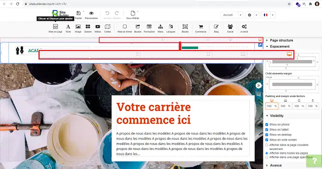
3. When checking the compatibility of your site on different types of support, it is quite possible that you will encounter problems with certain elements. Some of them may not be set up properly. You will therefore need to hide the element on the version affected by the problem in order to recreate it. Note that you should not resize the element on the version with the problem. The element will be resized on all versions of your site.
How do I hide an element on a version?
When you are optimising your website for the different versions (Mobile, Tablet or Desktop), you can hide certain elements that are causing problems on a specific version in order to create an element that is adapted to the type of medium.
To do this, click on the type of device you want to view (Desktop, Tablet or Mobile).
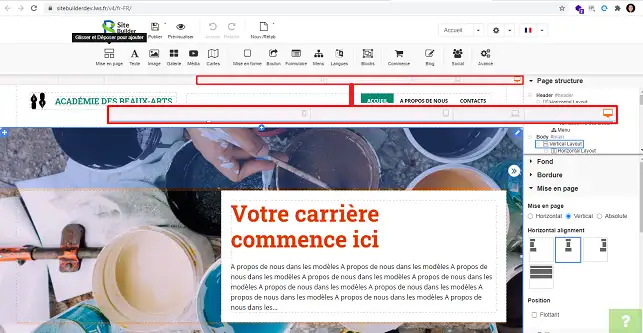
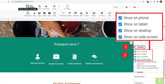
Then click on the stylus behind the item you want to hide and go to"Visibility".
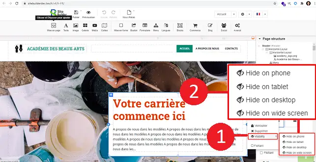
You can also find the element in the"Page Structure" section in the right-hand column of your SiteBuilder interface. Select the desired element by clicking on it in order to modify it.
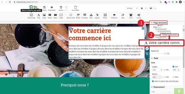
Scroll down the"Visibility" menu to hide the element on the desired type of support.
How do I optimise my site's menu for mobile phones?
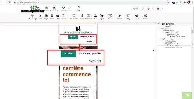
When you go to"Mobile", it is quite possible that the menu is not optimised. As a result, instead of seeing the mobile icon representing the menu, you will see the same menu as the one used for desktop computers.
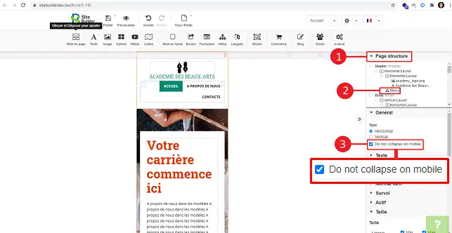
To optimise the menu, open the"Page Structure" menu on the right-hand side of your screen, click on"Menu" and uncheck the"Do not collapse on mobile" box.
How do I change the size of an item on a version?
On each version, you can change the size of the element you have set up. To do this, click on the element and go to the right-hand column, "Size". Here you can change the width and height as required.
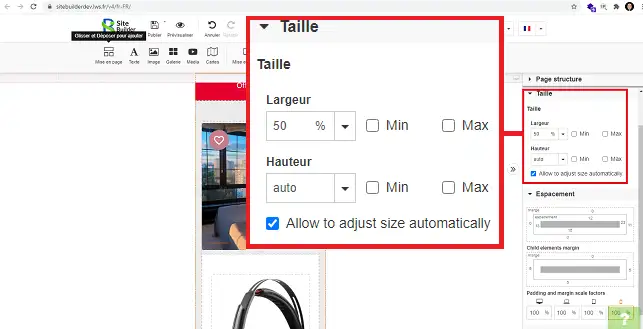
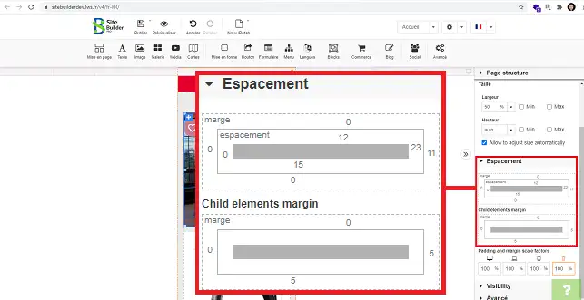
The space section allows you to change the margins of your item. Simply click on the number you want to change and enter the new value.
Conclusion
You can now optimise your site for all types of support on your web hosting with SteBuilder Pro. Optimising your site is very important as it will help you to rank your website better on the main search engines.
Don't hesitate to share your comments and questions.

 Contact us
 Customer Area


 Visit LWS


 Yes
Yes No
No Article read
21696 once
Article read
21696 once Merci ! N'hésitez pas à
poser des questions sur nos documentations si vous souhaitez plus d'informations et nous aider à les
améliorer.
Merci ! N'hésitez pas à
poser des questions sur nos documentations si vous souhaitez plus d'informations et nous aider à les
améliorer.
 About
About 